01 / One subject
You share food. Nothing else.
No chat, no feed, no profile, no display name. For the length of the challenge you are both a user id and a plate of food.
An iOS app for two people on the same eight weeks. You photograph what you ate, the day prints itself as a receipt, and seven receipts bind into a paper journal you both sign.
App Store
Build complete · preparing submission
01 / Why it exists
In China a dazi (搭子) is a partner for exactly one activity: a lunch dazi, a gym dazi. What makes it appealing is how little it asks, and that is also why it falls apart. Nothing holds the pairing together, so it quietly stops after a week and the search starts again. Dieting is the worst case, because it needs two months rather than one evening.
Three rules the whole product is built on
01 / One subject
No chat, no feed, no profile, no display name. For the length of the challenge you are both a user id and a plate of food.
02 / A fixed end
You pick 4, 8 or 12 weeks at setup and both pages count down to the same day. Nobody has to be the one who quits.
03 / Visible absence
No nudge, no guilt notification. An empty dashed frame on the day's receipt, and a counter that reads MISSED 1 / 3.
02 / How it works
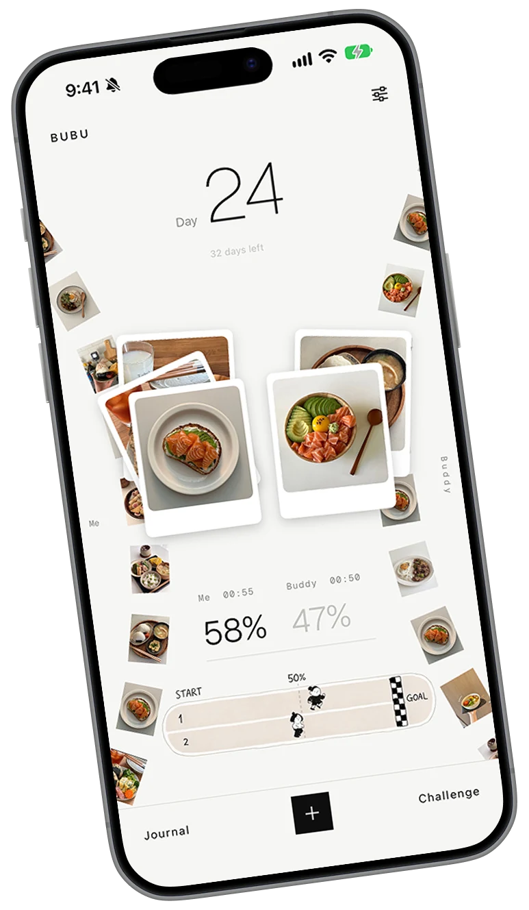
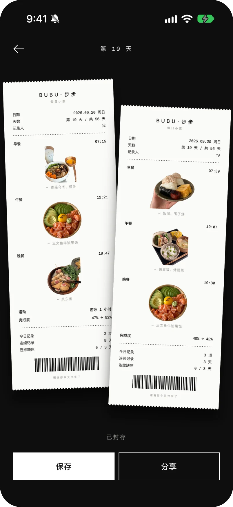
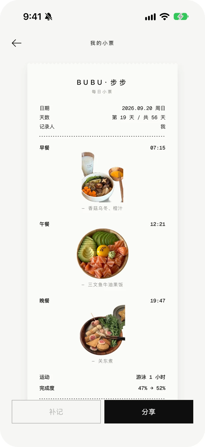
There is no form to fill in. You shoot the plate, the app cuts it out of its background, and from there the product is three pieces of printed matter: a receipt a day, a spread a week, and a track that runs the length of the challenge.
The day
A receipt is already read as a day that has been closed and totalled. Sealing it means yesterday cannot be edited to look better, which is the only reason the other person's copy is worth anything. It is also the most useful answer to what to eat tonight: a real meal, eaten by someone on the same plan.
The week
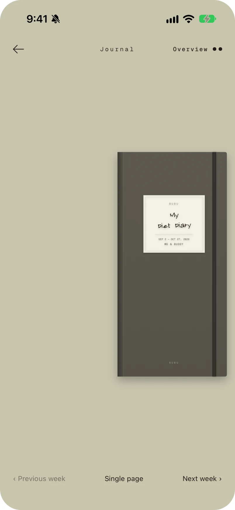
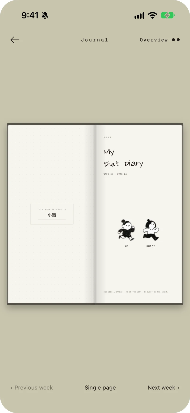
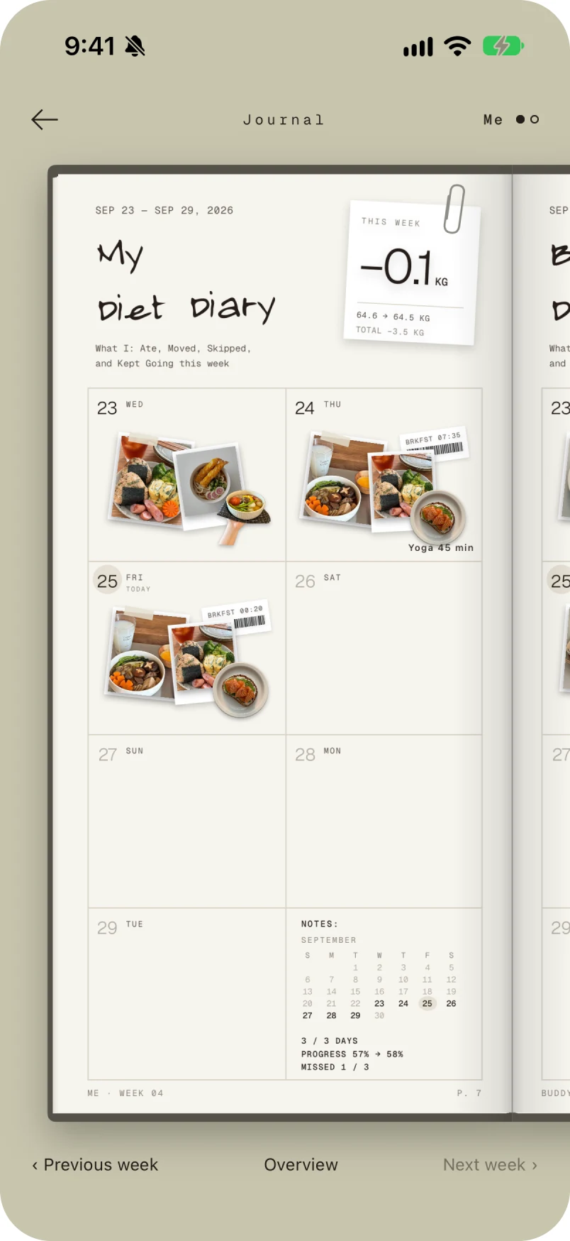
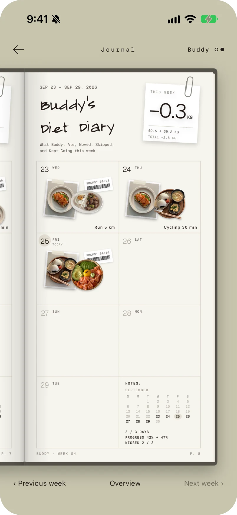
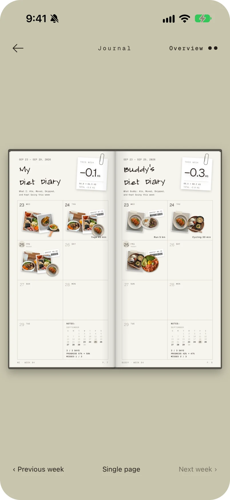
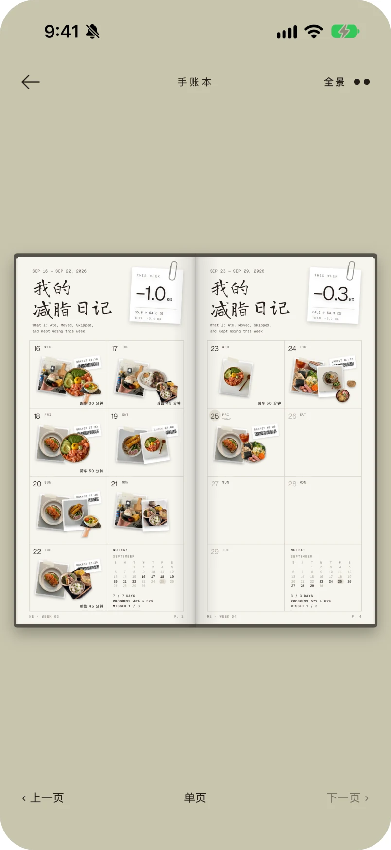
The journal is the only place the two of you are shown as one object. Turn it and the cover, the title page, your week and their week come up in order; open it flat and both weeks read across the gutter at once.
The finish
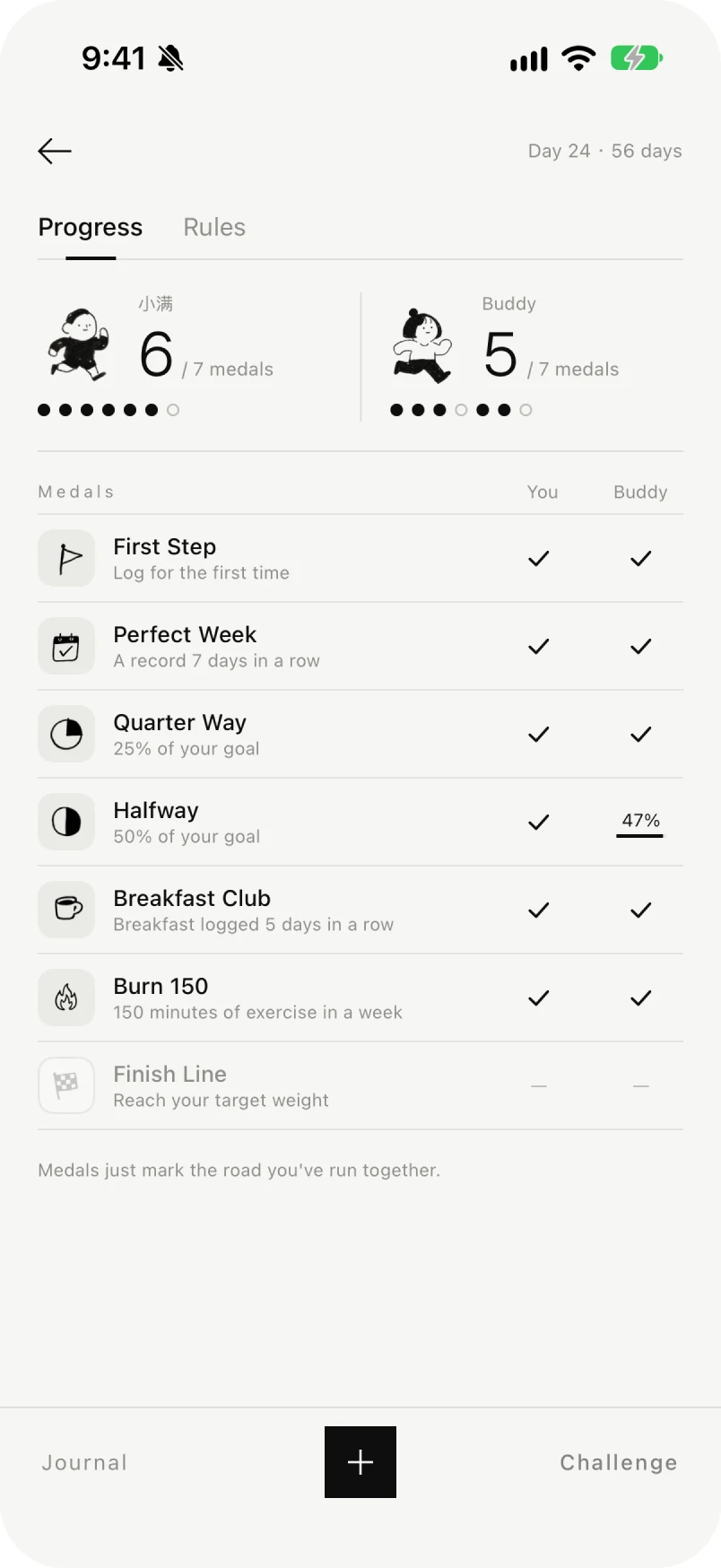
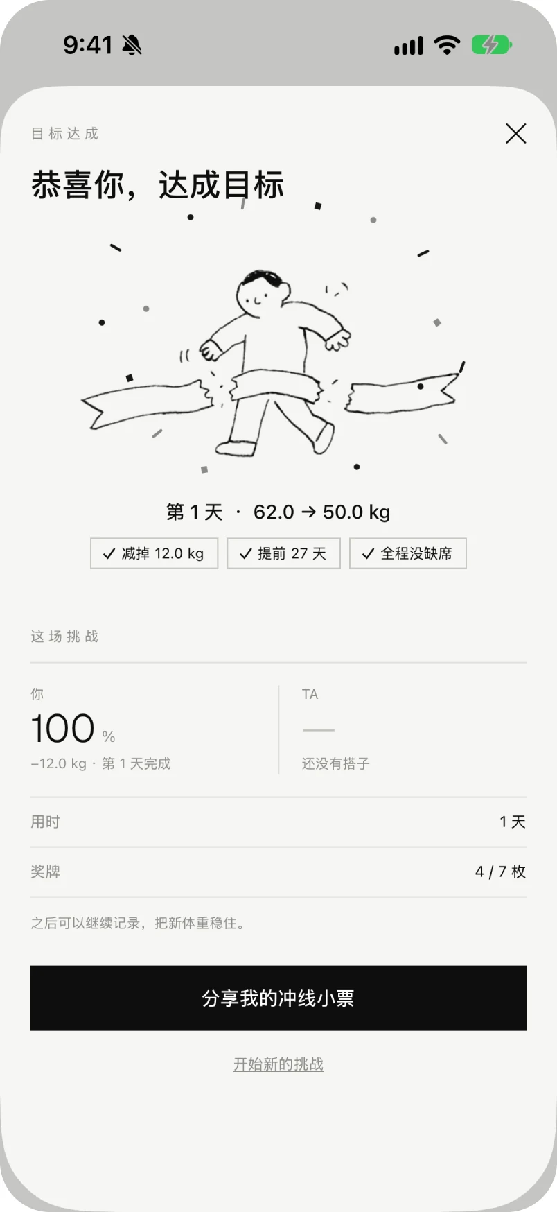
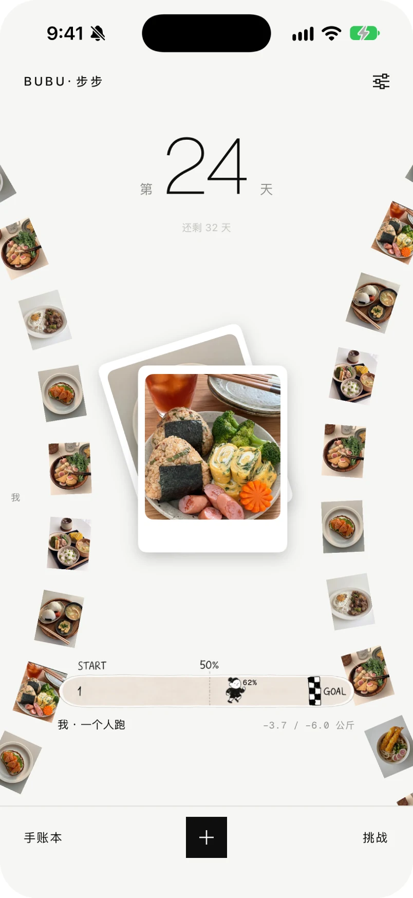
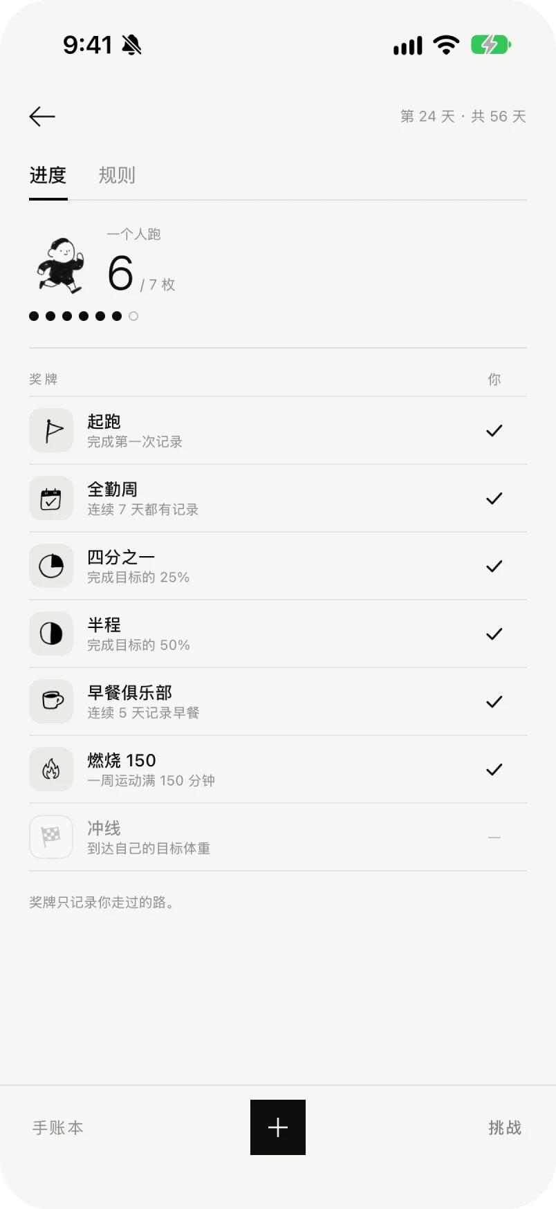
The home screen keeps the two of you on one track. The challenge page keeps the rules and the count. When the date arrives, the last screen is a celebration and a receipt you can share.
03 / What testing changed
Before TestFlight I sat down with two people who would meet the app from opposite ends: someone who would use it, and someone who has shipped things like it.
How a third person joins
Both conversations were about the prototype, before any real pair had run a challenge.
04 / The look
The whole app is one material. Nothing floats, nothing has a shadow, and nothing is rounded except the phone it runs on.
Four surfaces, one ink
Paper
#F6F6F4
Every screen but the journal and the receipt
Board
#C8C5AD
The journal's cover cloth and the desk it lies on
Page
#F6F5EE
The journal's own paper, a shade warmer than the app
Ink
#0E0E0E
Type, rules, the black key and the receipt ground
Two typefaces, no third
0123456789 · MISSED 1 / 3 · 08:05
Geist Mono carries every number, label and timestamp, because a receipt is a printed object and a receipt's numbers line up. Noto Sans SC carries the sentences. Nothing is set in a script face; the only handwriting in the app is drawn, not typed.
What the system refuses
05 / The cast
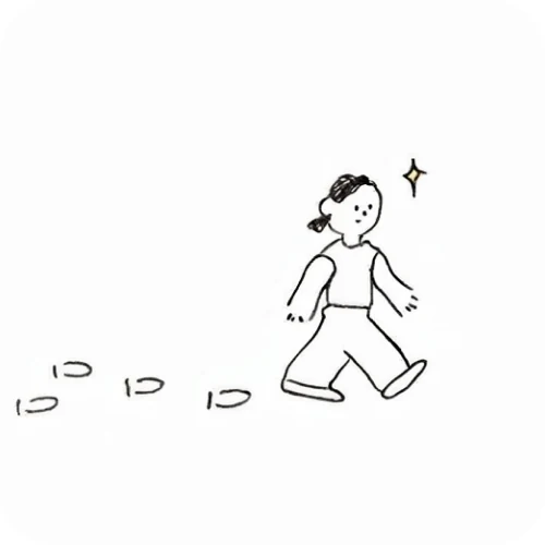
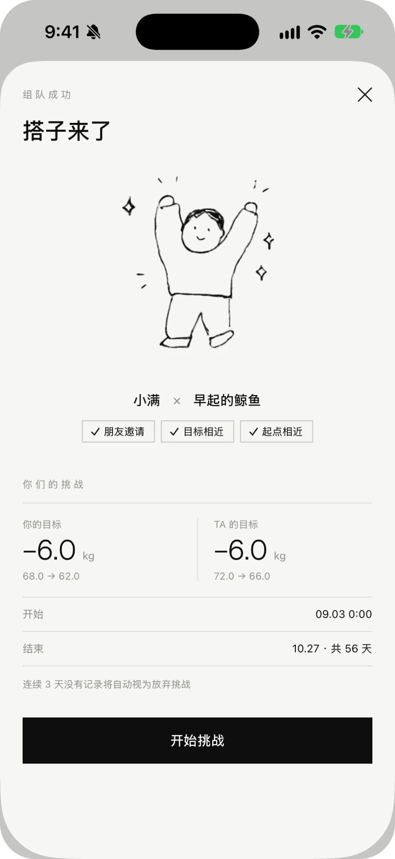
The app has no mascot and no illustration library. It has a cast of two, drawn with the same line as the interface rules, who appear only at the moments the product needs a person rather than a number.
Skipping
Empty states, and the pause between two challenges
Both of you
The screen that confirms a match
Solo
Home, when you are running the challenge alone
The finish
Crossing the line on the last day
Goal reached
The celebration screen, and the receipt you can share from it
The loops run while they are on screen and stop when they are not.
06 / Every screen
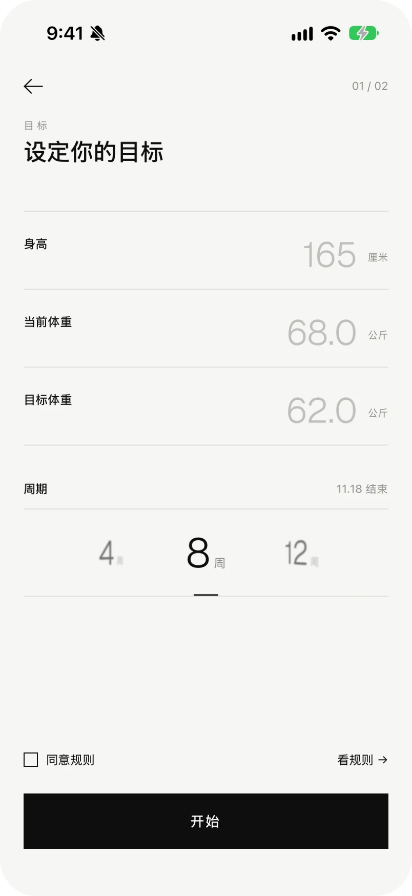
Nineteen screens captured on an iPhone 17 simulator, from sign-up to the settings page. Drag the strip.
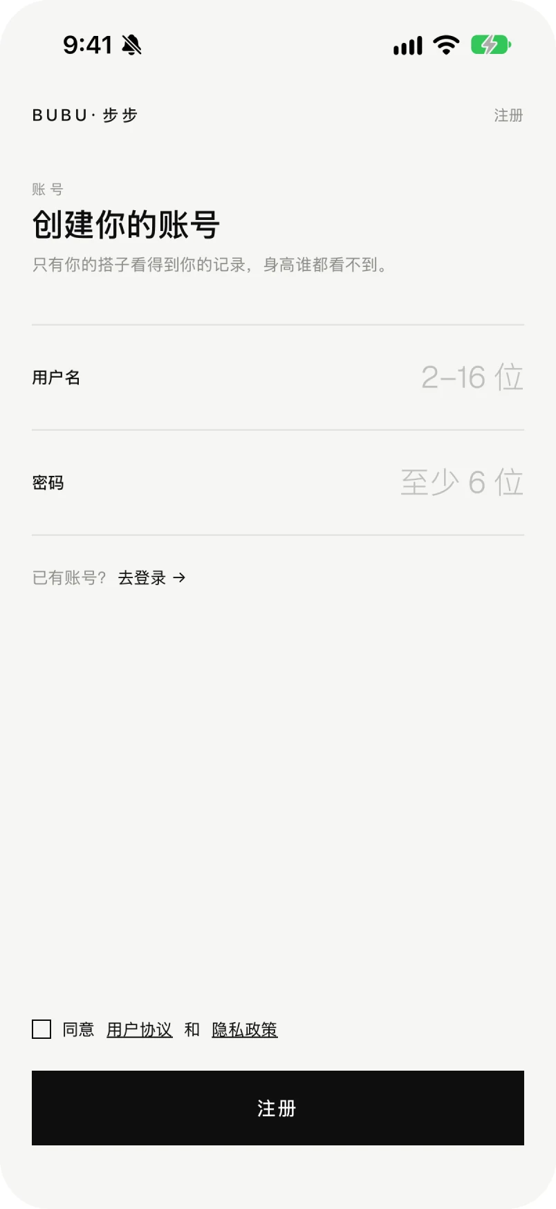 01 · Sign up
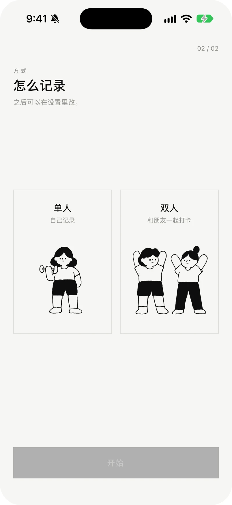 02 · Solo or paired03 · Set the goal
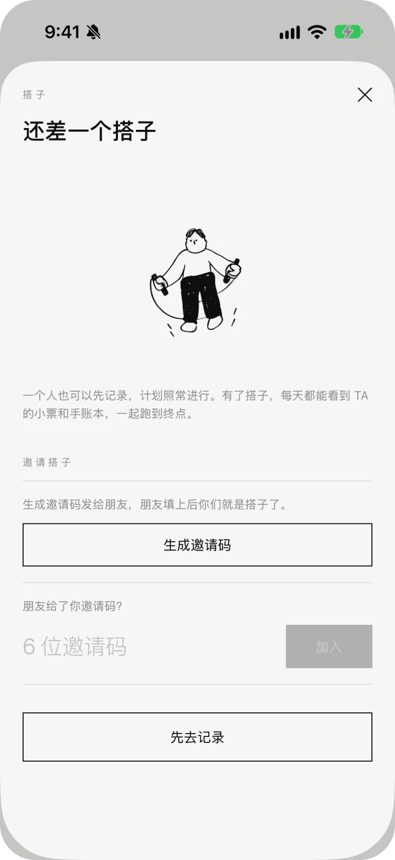 04 · Invite a buddy05 · Matched
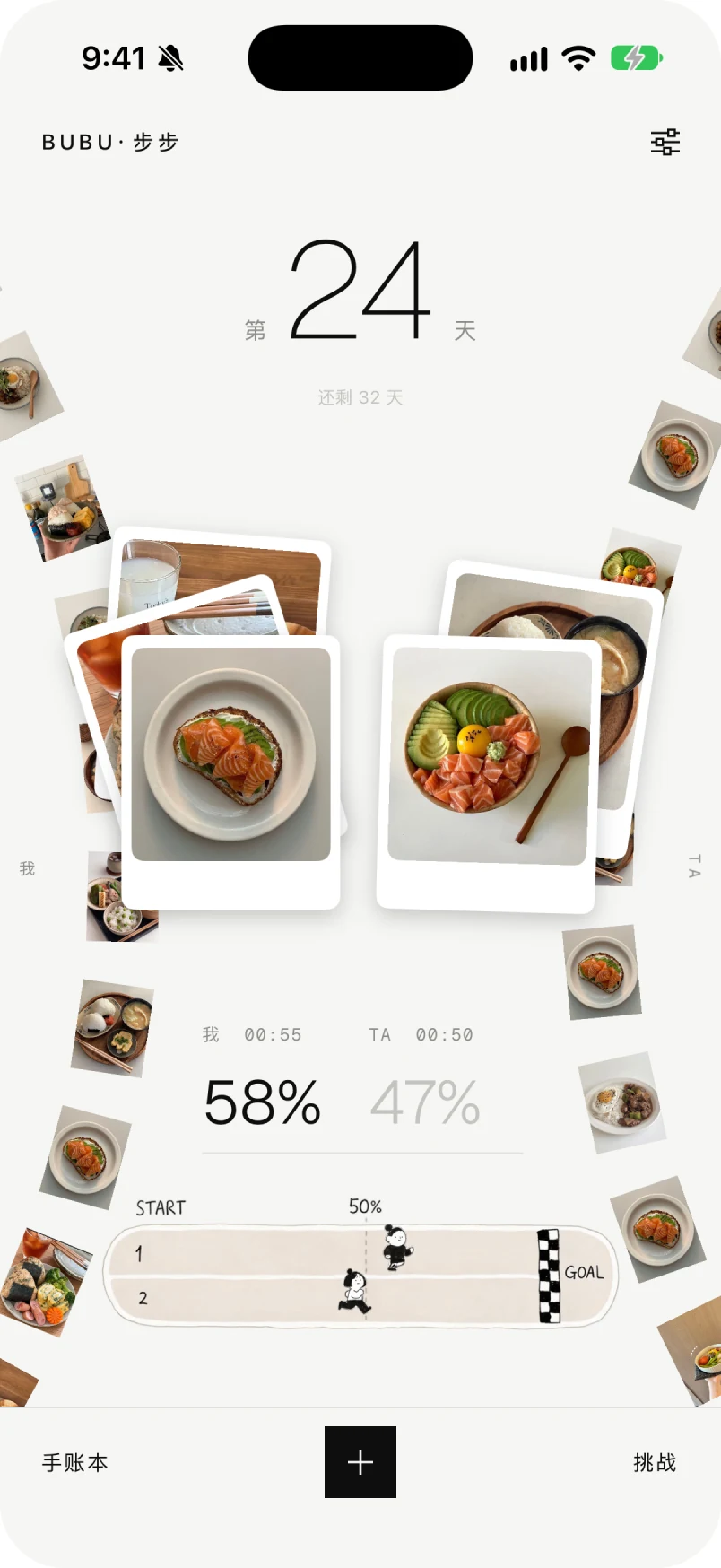 06 · Home · paired07 · Today's receipt · both08 · Today's receipt · mine
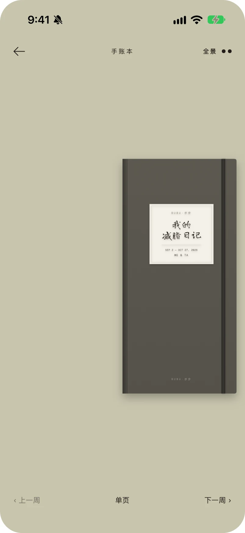 09 · Journal · cover
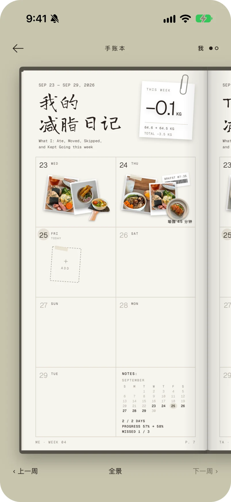 10 · Journal · my week
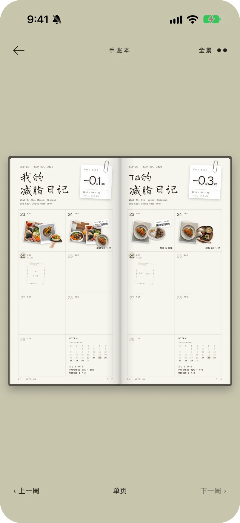 11 · Journal · the spread
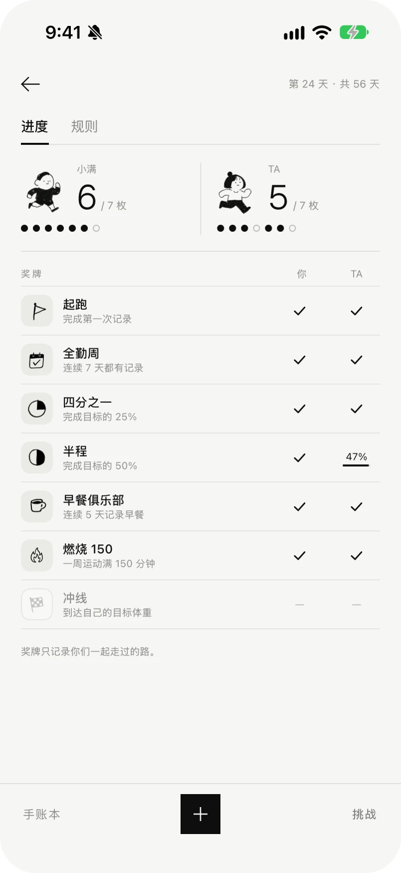 12 · Challenge · progress
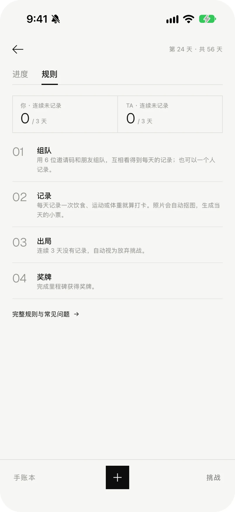 13 · Challenge · rules14 · Goal reached15 · Home · solo16 · Journal · solo17 · Challenge · solo
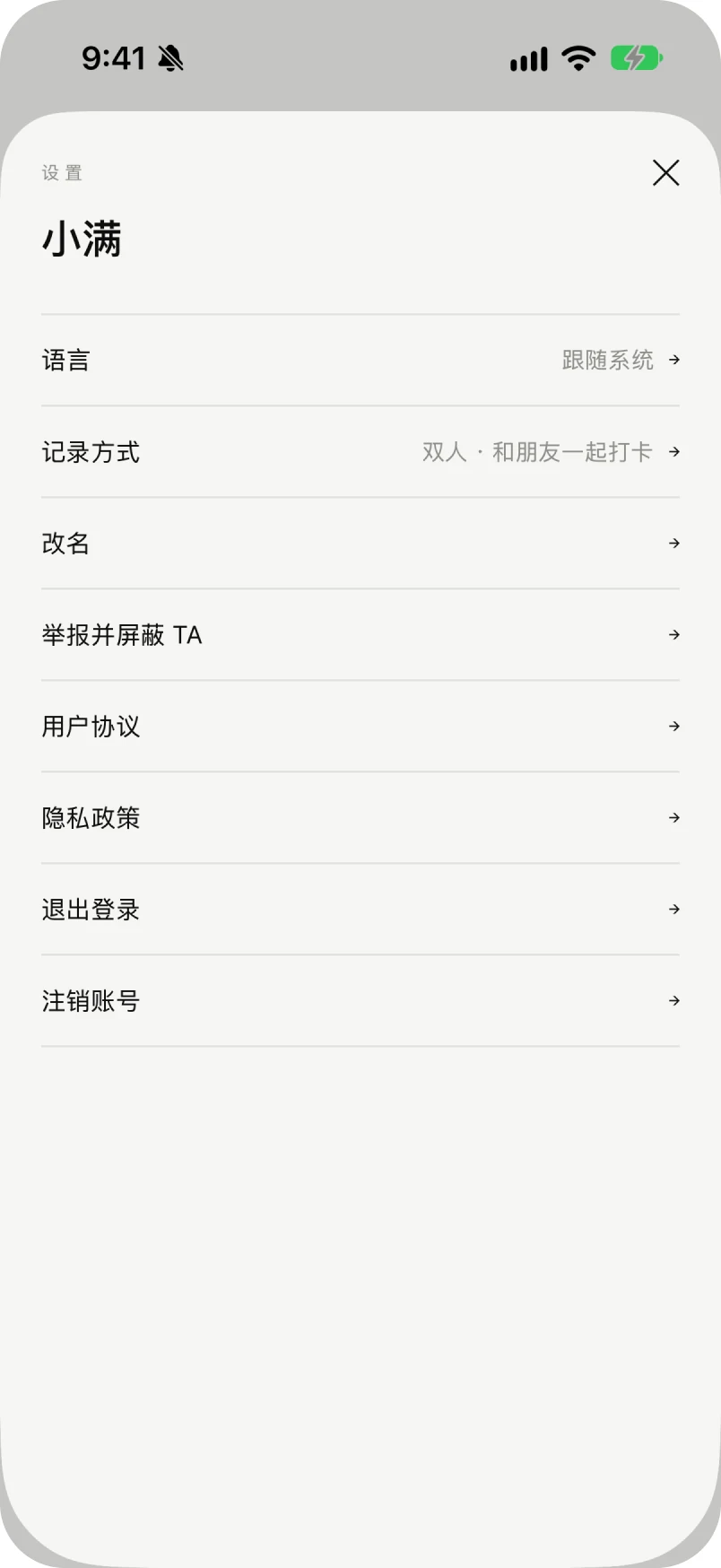 18 · Settings
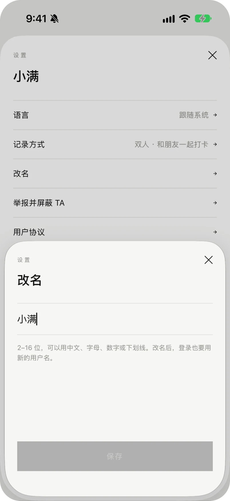 19 · Rename
07 / Shipping it
The app is not a prototype. It is a build that runs, and the work left is the work of getting a build reviewed rather than designed.
Done
Between here and the store
One thing is still untested: the whole product rests on the assumption that a stranger's receipt is motivating rather than uncomfortable. Two interviews moved the product, but two interviews are not eight weeks of use. That is what TestFlight is for.