What is Taroo?
A 22-card Major Arcana deck and the brand around it, made for reflection rather than prediction. Each card is a piece of graphic design you would leave out on a desk, not a relic you keep in a drawer.
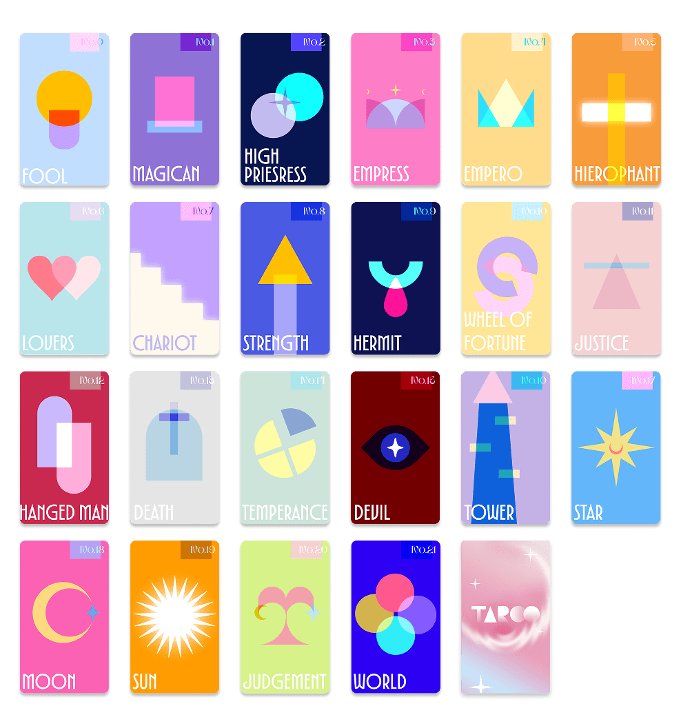
A tarot brand for people drawn to good design rather than fortune telling - 22 Major Arcana cards, packaging, and the visual system behind them.
Final Product
The Idea
What is Taroo?
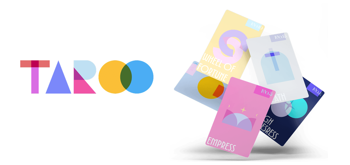
A 22-card Major Arcana deck and the brand around it, made for reflection rather than prediction. Each card is a piece of graphic design you would leave out on a desk, not a relic you keep in a drawer.
Who is it for?
People who would never describe themselves as spiritual but who collect beautiful, useful objects - students, designers, illustrators, journalers, anyone who wants a prompt to think with.
What should tarot feel like instead?
Readable in about five seconds. Approachable enough to hand to someone who has never touched a deck. Reflective without being solemn or occult.
Design Direction
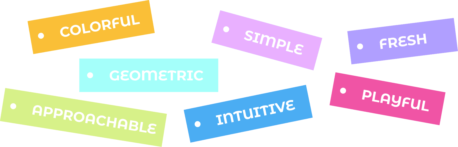
Approachable, modern, and reflective only became useful once each one was turned into a rule about shape, color, or surface.
Approachable
No occult symbolism and no scenes to interpret. A card is one shape, one color, one word, so it can be read before you know anything about tarot.
Modern
Everything is drawn with hard-edged geometry and bright pastels, set in a wide contemporary display face. Nothing engraved, nothing gothic, no gold foil.
Reflective
The card back and the box interior are the only gradients in the system. The quiet surface is the part you touch; the fronts stay bright so a reading never feels heavy.
Key Design Decisions
Color, illustration, and typography were each solved once as a system, then applied twenty-two times without exception.
01 / Color system
Traditional decks run a single palette across all 78 cards, which makes them beautiful as a set and unreadable one at a time. Taroo gives each arcana its own field color, spread around the hue circle and split into three value bands - pale for the cards about beginnings and balance, saturated for the cards about action, and near-black for the three heavy ones.
Color becomes the fastest way to recognise a card, and the deck still reads as one family because every hue is mixed back toward the same pastel base.
Fool
#C2DEFF
Magician
#8E72D6
High Priestess
#071551
Empress
#FE7DC7
Emperor
#FFDC8C
Hierophant
#F89B3B
Lovers
#B8E6EB
Chariot
#C2A1FF
Strength
#4A5AE3
Hermit
#0F1252
Wheel of Fortune
#FFE696
Justice
#F5D2D1
Hanged Man
#CA294F
Death
#E5E5E5
Temperance
#CDE4DA
Devil
#720000
Tower
#C4B1E6
Star
#63B6F9
Moon
#FB62B3
Sun
#FF9C01
Judgement
#D7F289
World
#2D00F4
02 / Illustration language
Every card is built from the same kit - circle, square, arch, four-point star, right triangle, leaf - and nothing else is allowed in. Death is the arch with a cross laid over it, the Moon is a circle subtracted by a circle, the Tower is a triangle sitting on a tapered column.
The constraint is what holds twenty-two illustrations together without a shared outline style.

03 / Typography & hierarchy
Card information sits in the same place every time: the arcana number in a tinted chip at the top right, the name locked to the bottom-left baseline, the illustration centred between them. Names never run past two lines, so the layout is identical across the deck.
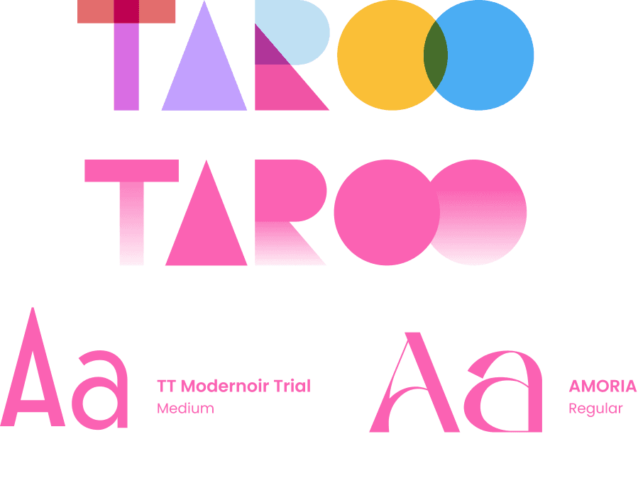
TT Modernoir Medium carries the names - wide and geometric enough to read as part of the illustration - while Amoria Regular handles the numbers in a lighter, more classical voice. It is the one deliberate nod to traditional tarot in the whole system.
Audience & Positioning
Three decks own the modern tarot shelf. Each solves one thing well, and each leaves the same thing open.
Who I designed for
People who would not call themselves spiritual but who love meaningful design, visual tools, and personal insight - students, artists, designers, journalers, and anyone who simply wants a beautiful, useful deck on their desk.
Personality traits
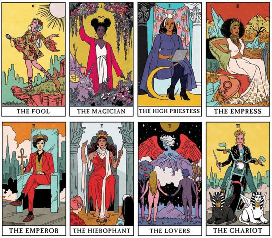
Character-driven · Feminist · Illustrative
A contemporary retelling of the Rider-Waite deck with diverse modern characters, aimed at empowerment and inclusivity.
Still a scene to read. Every card needs interpreting before it can be used.
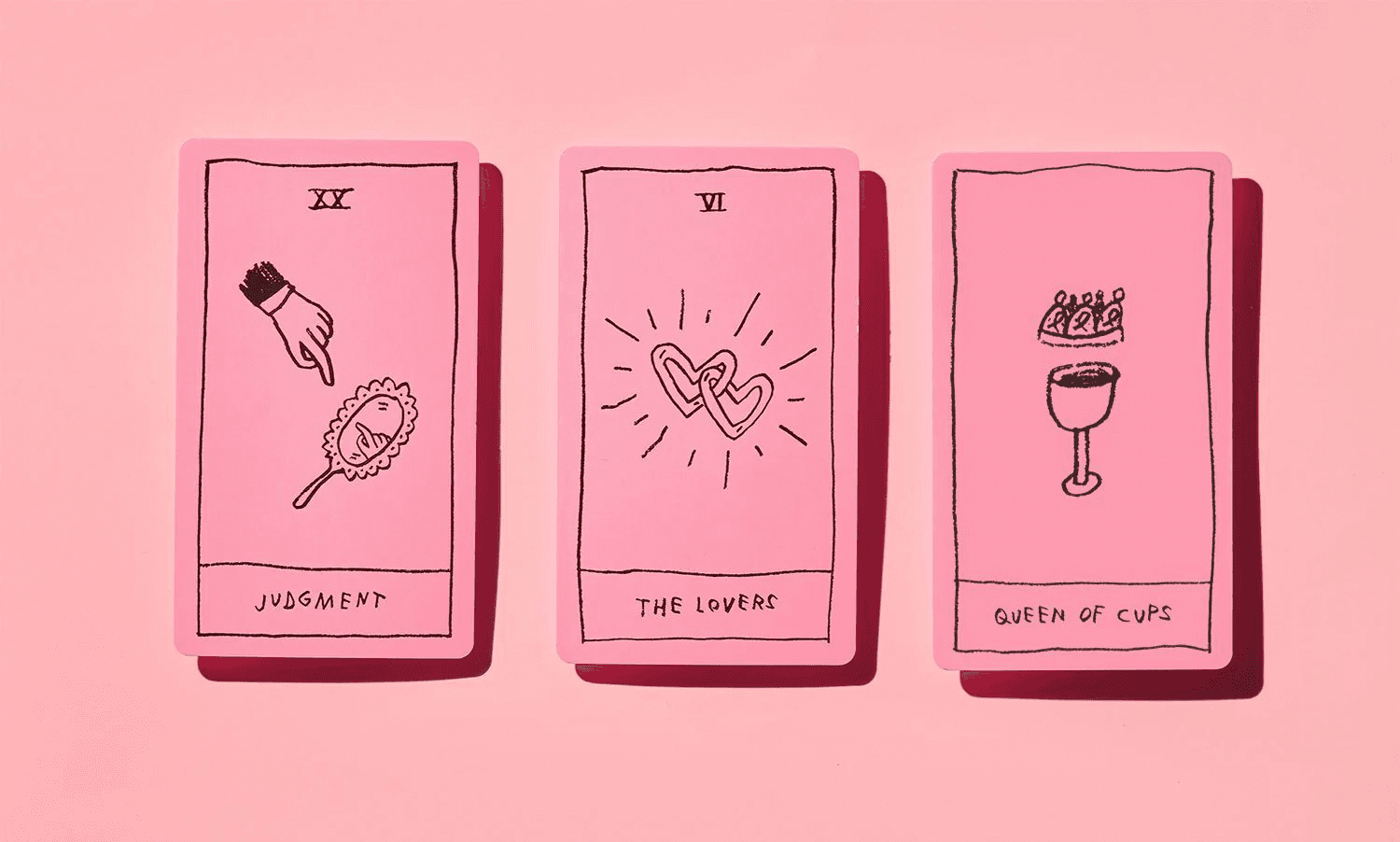
Minimalist · Beginner-friendly · Faceless
Simple line drawings, faceless figures, and a single pink palette. The lowest barrier to entry on the shelf.
One palette across the whole deck, so no card is recognisable on its own.
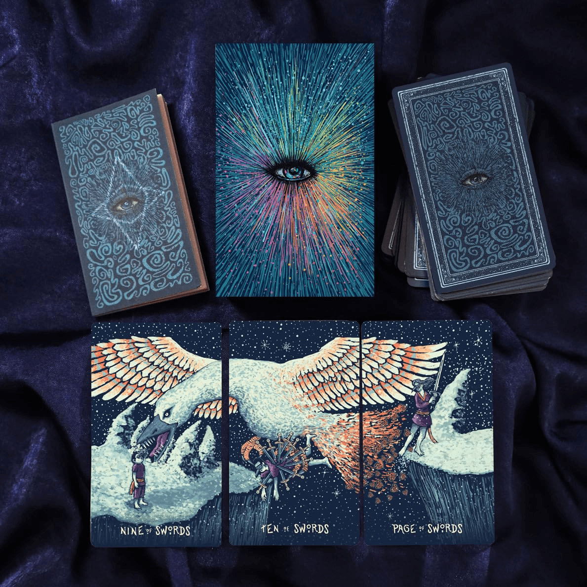
Painterly · Collectible · Continuous artwork
Dense hand-painted artwork on a dark ground, with cards that join into one continuous illustration across the set.
A collector's object for people who already read tarot, not an entry point.
Taroo sits where OK Tarot's approachability meets Prismavisions' collectibility: simple enough to read cold, distinct enough to want the whole set.
Brand System
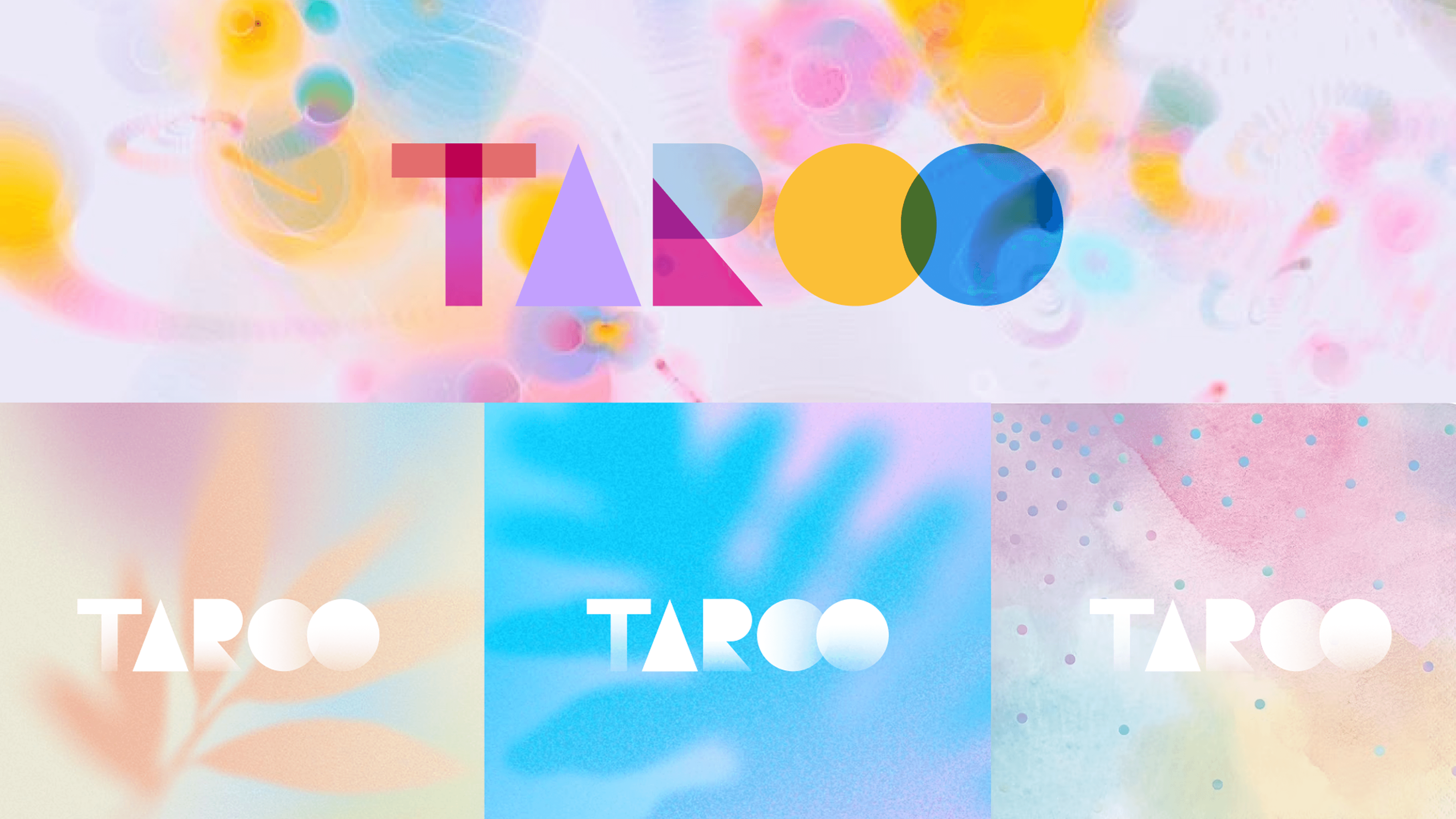
T, A, R, O, O are cut from the shape library rather than set in a typeface. Seven shapes make the five letters, and the three places two of them cross are where the rest of the palette comes from.
Seven shapes
Three crossings
Product Details
The cover treatments reuse the card back rather than inventing a second look for marketing.
Reflection
Limitation
The deck stops at the 22 Major Arcana. Extending it to the 56 Minor Arcana would be the real test of whether one color per card survives four suits.
Key tradeoff
Dropping figurative imagery makes the cards instantly readable but removes the narrative detail experienced readers rely on. I chose recognition over depth.
Next validation
Print a physical run and watch first-time readers sort it. If they group the cards by value band without being told, the color system is doing its job.