01 / Understand
See which category needs attention.
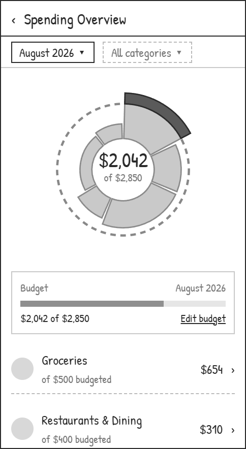
Select a category to see its amount, budget, and status in one place.
Understand the spending. Correct the details. Adjust the plan.
01 / The core experience
Each part of the flow pairs a visible interface change with the decision it helps someone make: find the issue, trace its source, then adjust the plan.
01 / Understand
Select a category to see its amount, budget, and status in one place.
02 / Investigate
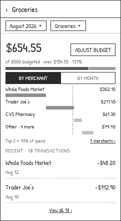
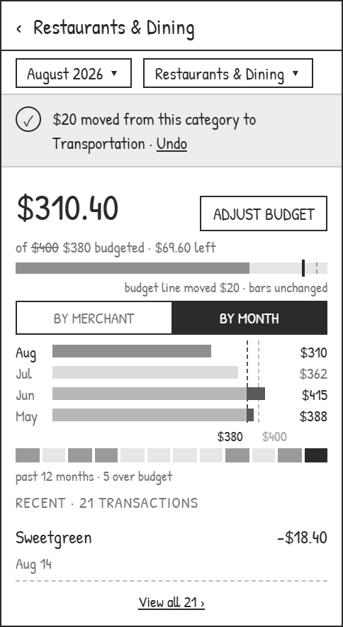
Switch between merchant and monthly breakdowns without losing the active month, category, or budget.
03 / Adjust
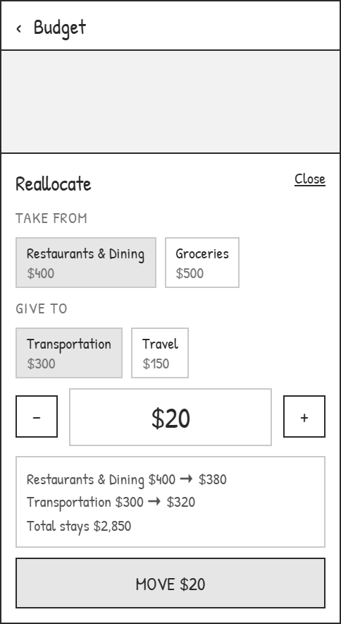
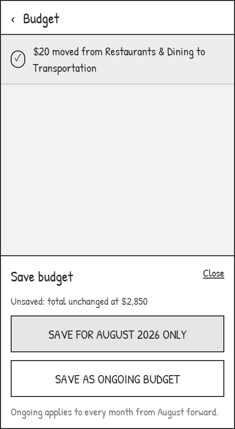
Move an amount between categories, preview both limits, then choose whether the change is temporary or ongoing.
02 / Interactive prototype
Explore the connected mobile flow using sample transactions and budgets.
Select a category in the dial, compare its merchant and monthly breakdowns, then open its transactions.
Select transactions and assign a category together, keeping the active month and category in context.
Reallocate category allowances, review the new limits, and choose a one-month or ongoing change. This adjusts the plan; it does not transfer funds.
The optional assistant demonstrates suggested questions and responses based on sample data. Free-text questions and live AI are outside this prototype.
03 / Research & problem framing
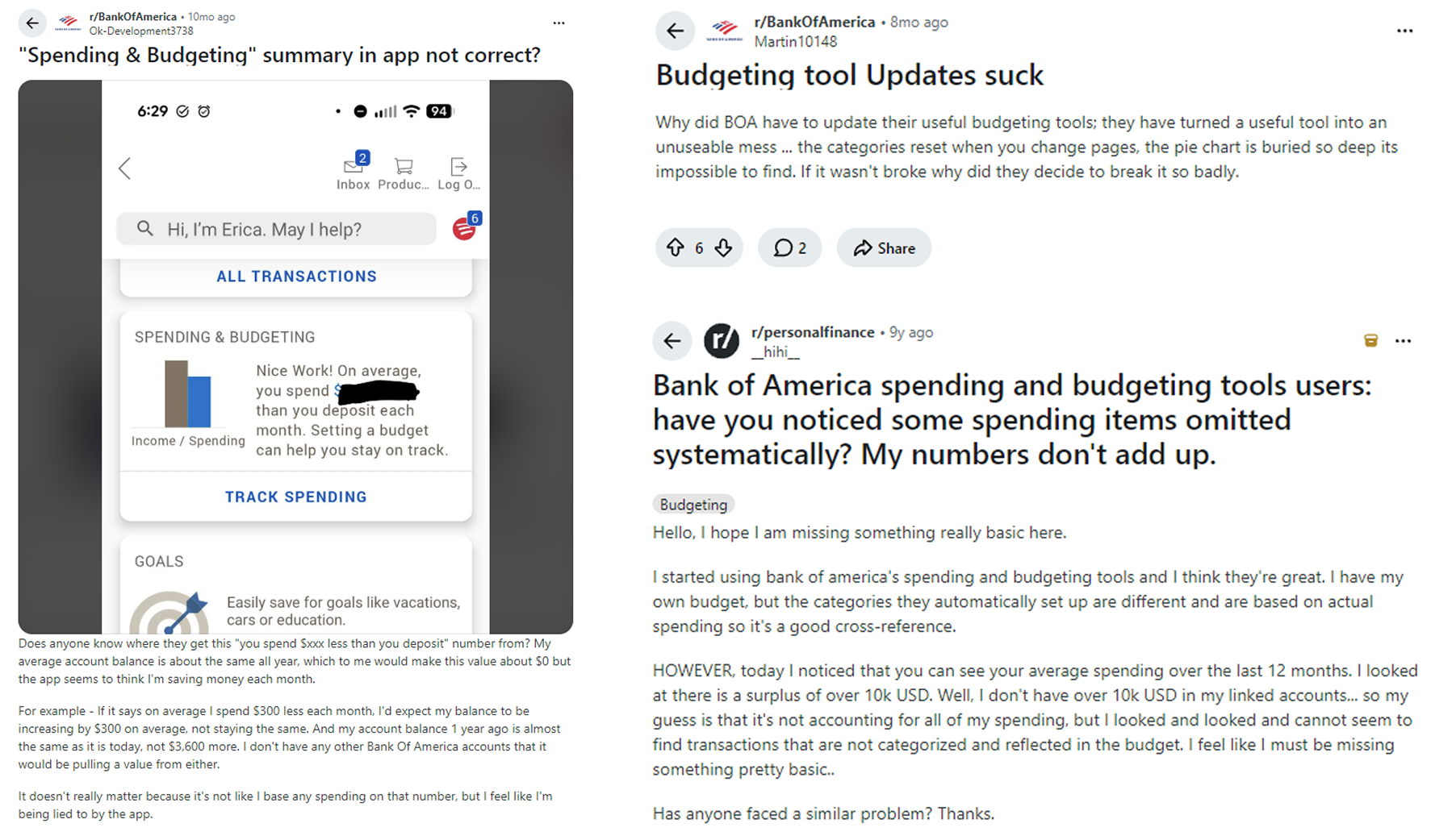
The research focused on finding and verifying spending, correcting categories, and adapting a budget during the month.
Participants had used Bank of America, but not necessarily its budgeting feature. This was a small, directional study rather than a representative sample.
01
Users had to move between summaries, categories, and transaction lists to understand where a total came from.
02
Fixing a category required opening transactions one at a time, while filters and selections could reset on return.
03
A small monthly adjustment could send users through setup steps that did not match the change they wanted to make.
Selections reset
Insights hard to find
Correction takes time
Budgets feel inflexible
These four recorded survey findings are preserved from the research notes. Uncertainty about how totals connect to transactions is retained as a qualitative theme rather than shown with an unverified percentage.

Task flow comparison
Direct access replaces the hidden entry, filters stay visible, and category changes happen inside the transaction flow.
 Open full size
  Open full size
 The redesign starts from the current budget, supports focused edits or reallocation, and avoids restarting the setup process.
 Open full size
  Open full size
 Entry
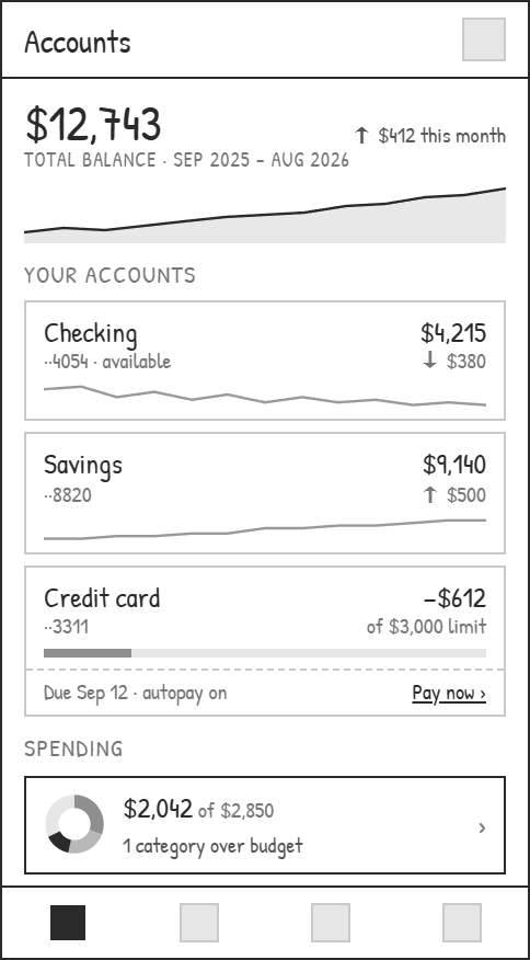
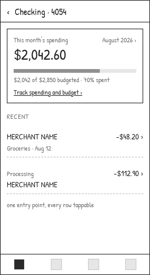
The reviewed flow placed spending several screens below the account. These wireframes bring the monthly total to the accounts list and checking card, with a path from transactions back into spending.
Track spending
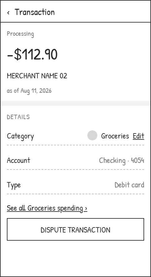
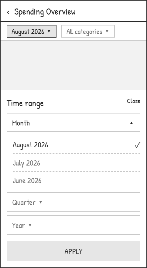
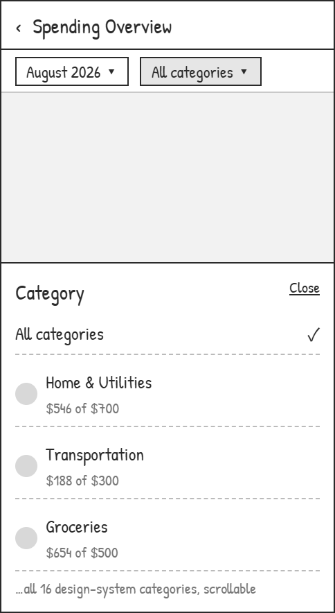
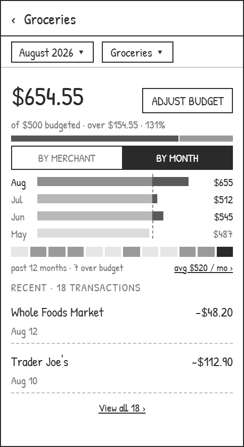
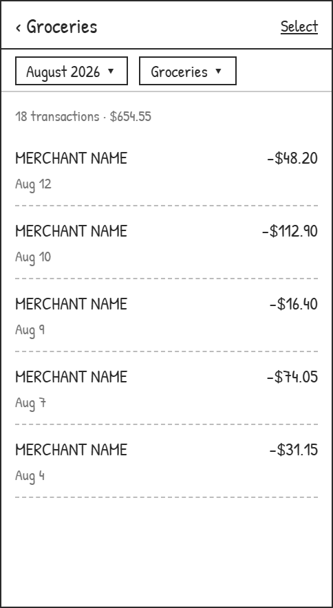
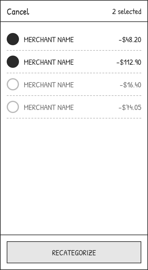
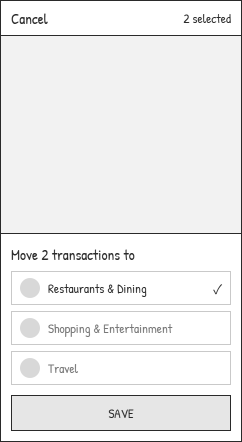
The two pickers stay pinned above the overview, the category breakdown, and the transaction list, so stepping into a merchant and back does not clear them. Correcting a miscategorised charge happens in the list itself — select several, move them once — instead of one transaction detail at a time.
Budget
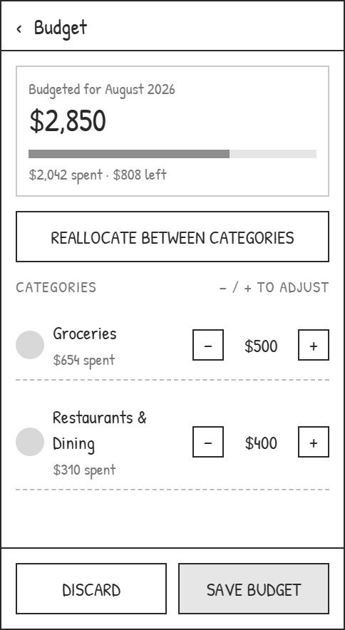
Categories can be edited or reallocated while the total stays visible. Saving is a separate decision: apply the adjustment to this month or keep it as an ongoing plan.
04 / Testing & iteration
The same six participants completed both task rounds.
Key iteration / Budget reallocation
Next question
Next, test one-month versus ongoing changes, undo, and insufficient-funds cases.
Spending chart
Five of six participants identified the most overspent category without help after the selected category, budget ring, and text status were made more explicit.
Assistant exploration
Four of six participants resolved a follow-up question in the prototype assistant, compared with one of six using navigation in the comparison round.
Directional evidence only: returning participants saw substantially different interfaces, so practice effects and multiple design changes may have influenced the results. The assistant comparison is exploratory.
05 / Web adaptation
Mobile reveals details one view at a time. Desktop keeps the category overview beside merchant and monthly breakdowns, with the assistant available in a side panel.
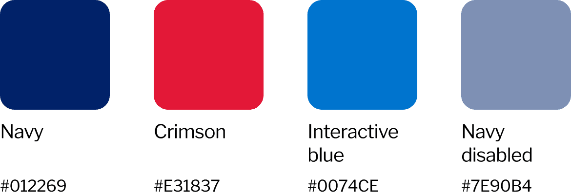
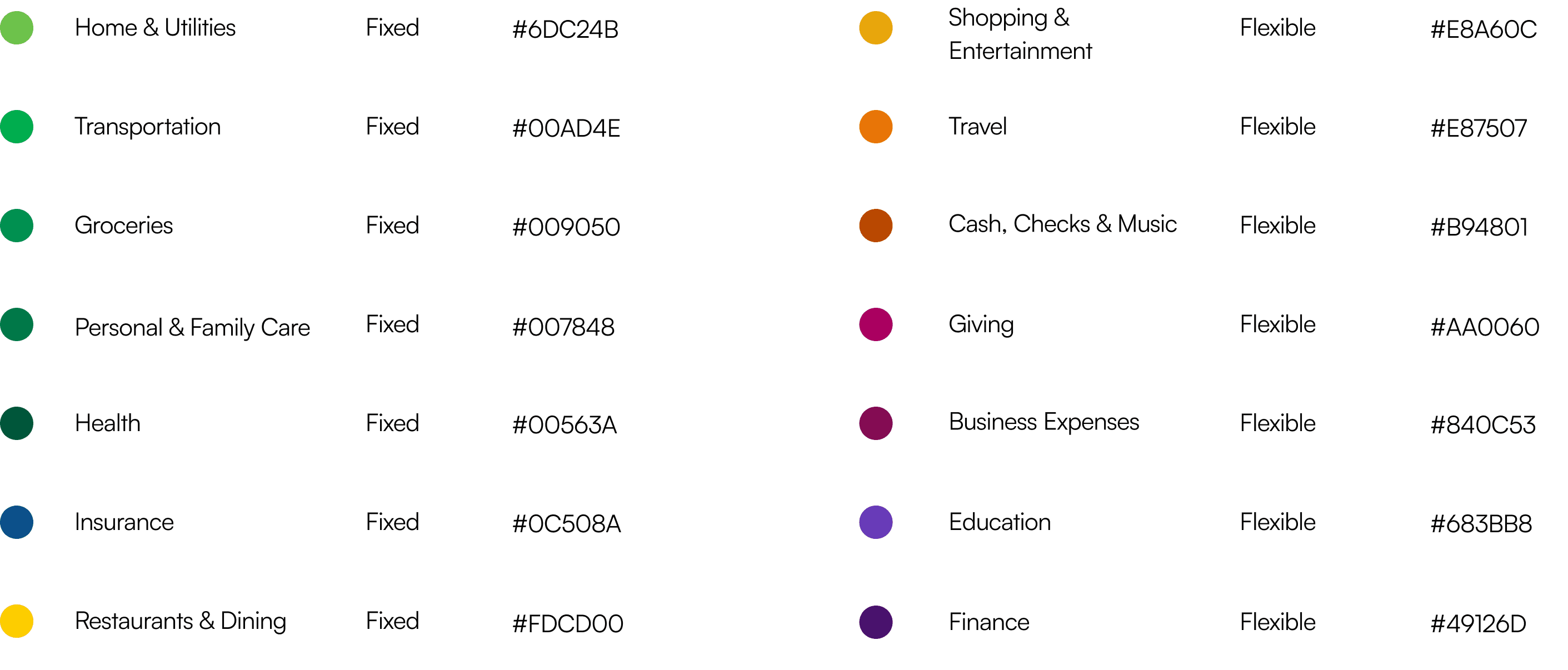
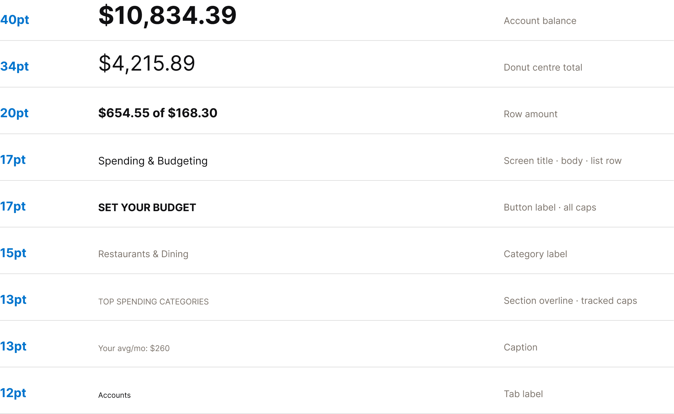
Familiar banking navigation, category colors and typography support the revised flows. Text values and budget lines accompany color so the status has more than one cue.
Reflection
A broader study should separate the effects of persistent context, the revised chart, and the reallocation preview, while testing accessibility and error recovery.
Independent redesign concept. Not affiliated with Bank of America.