Implemented during the internship
Overview and task-based navigation.
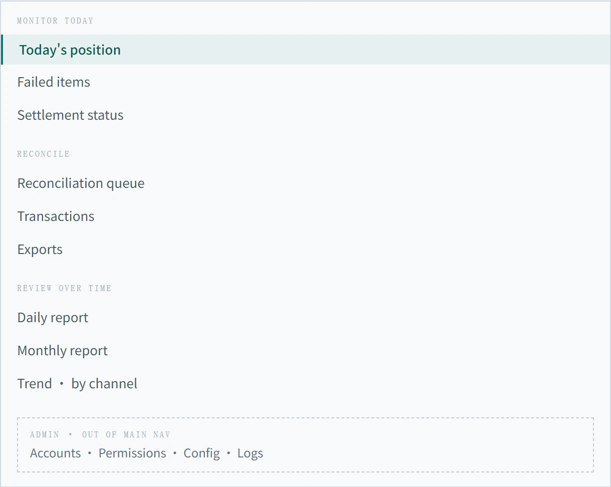
I delivered Today's overview and the adjacent navigation that groups daily monitoring, reconciliation and reporting tasks.
Bringing daily finance information into focus through clearer hierarchy and task-based grouping.
The redesign
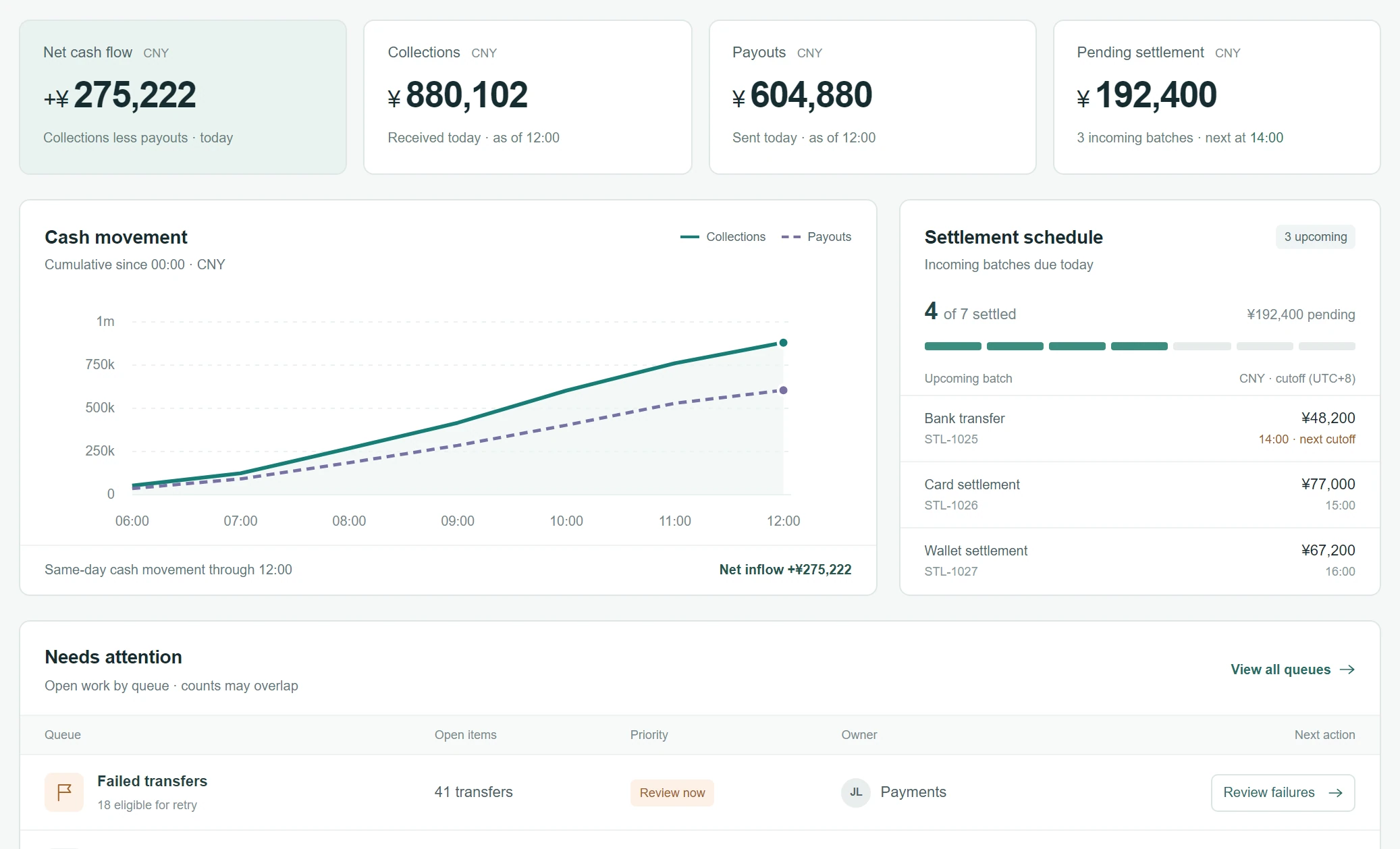
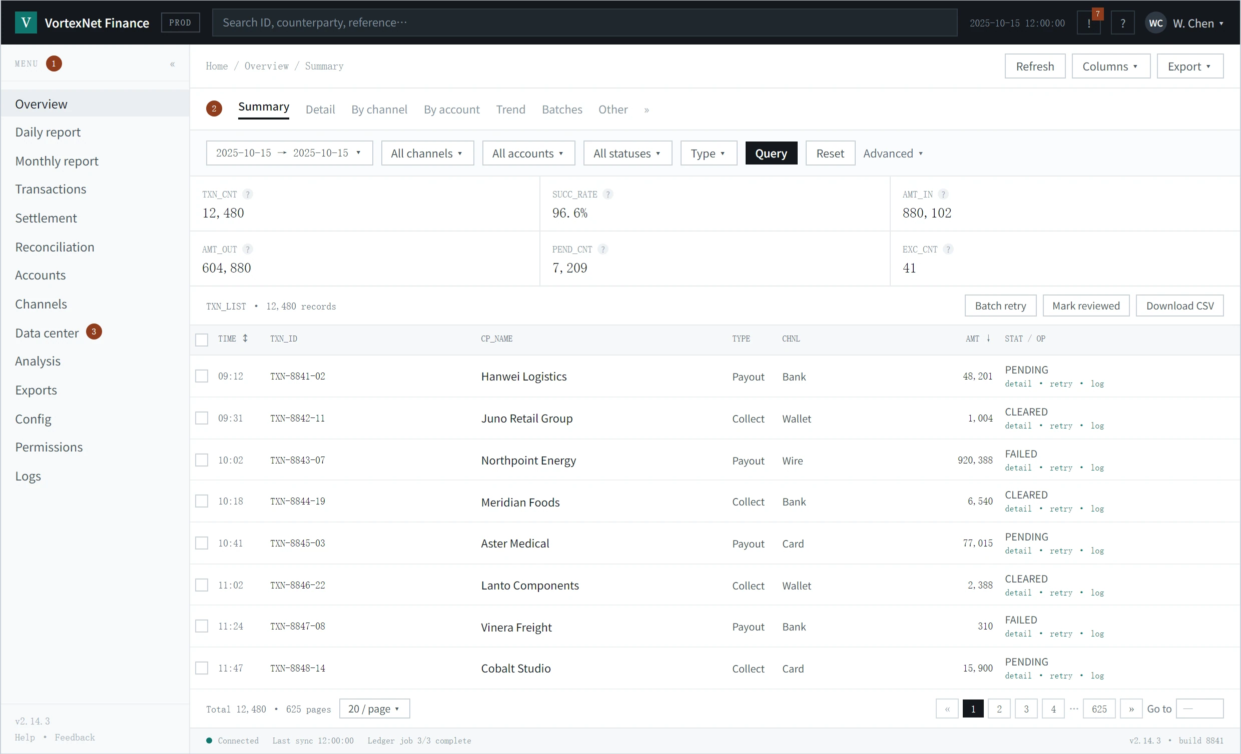
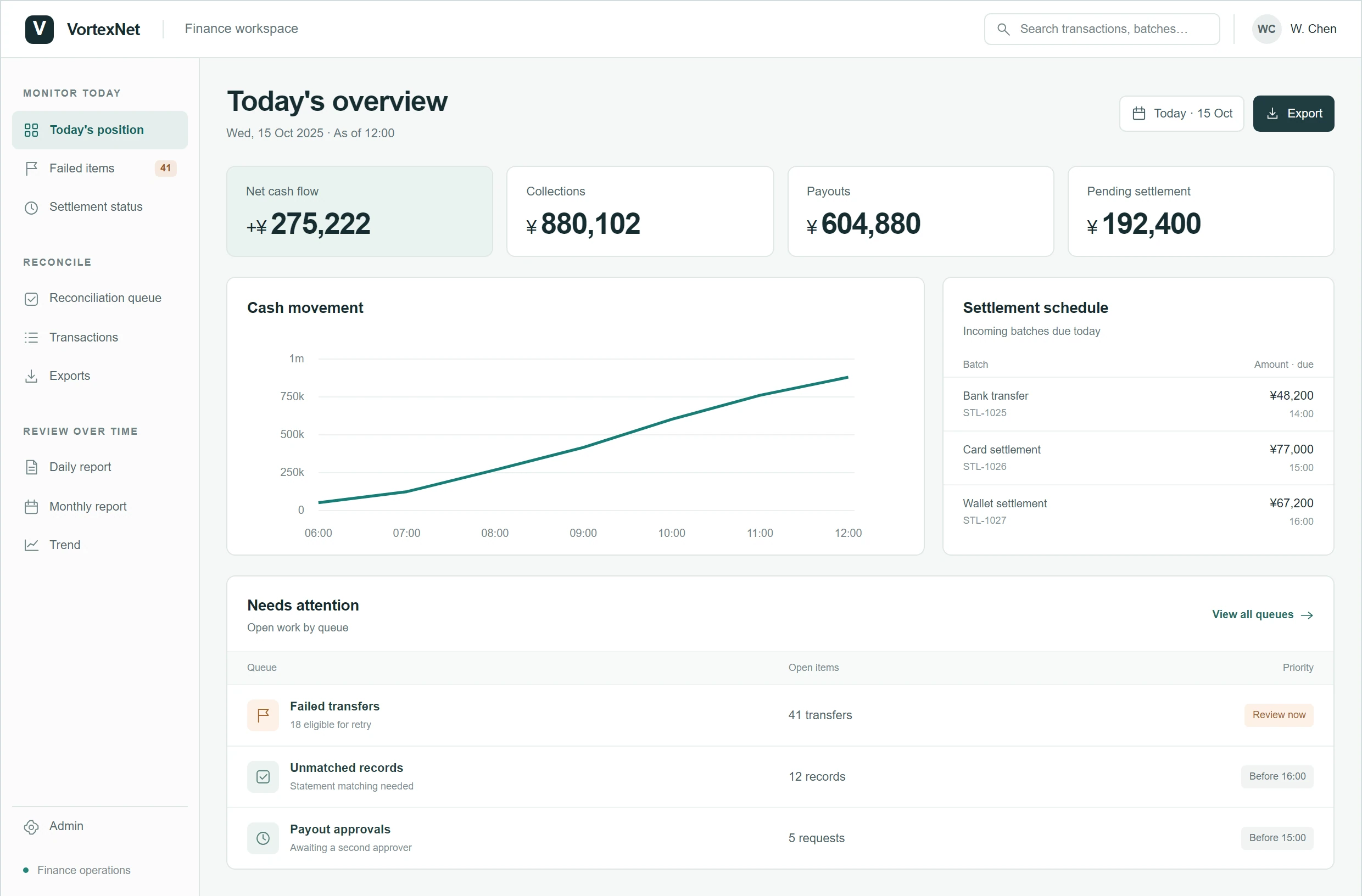
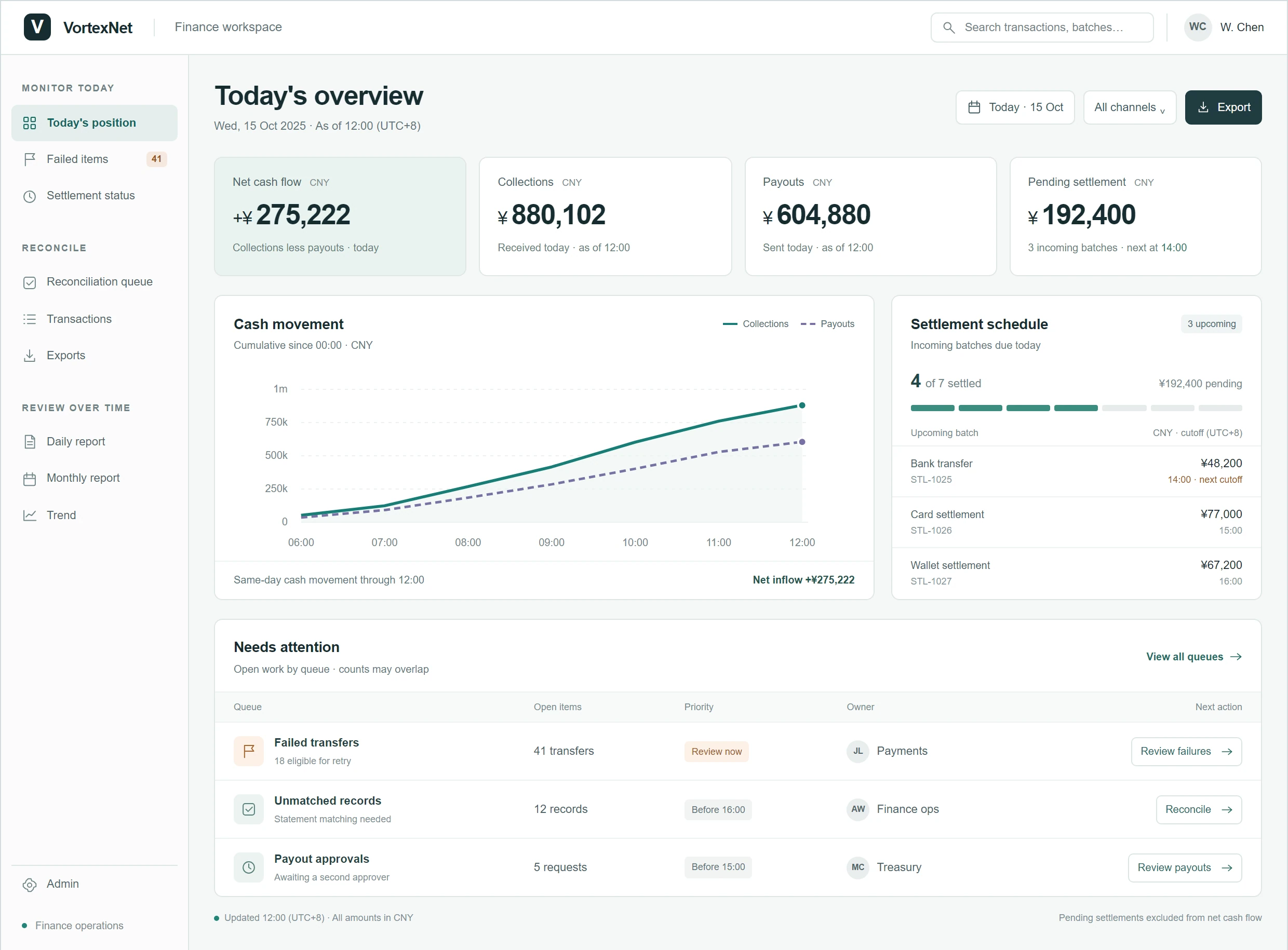
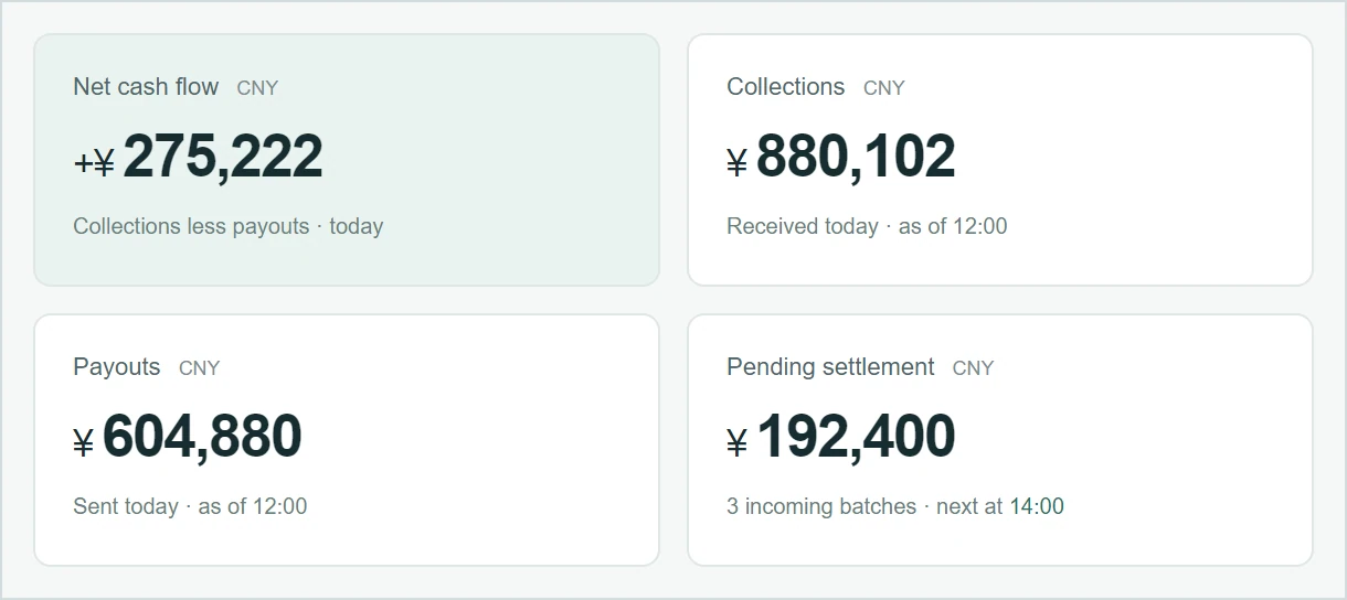
The dashboard connects a cash summary, settlement progress and a prioritized work queue. Each view supports a different daily decision. Use the toggle to separate what shipped from what was refined later.
Implemented during the internship
I delivered Today's overview and the adjacent navigation that groups daily monitoring, reconciliation and reporting tasks.
Outside my implemented scope
The destination pages and their end-to-end workflows are not presented here as work I implemented.
Refined afterward
For this case study I later refined the metric definitions, cash chart, settlement schedule, owners and next actions, keeping the tool's test data. That version is the third toggle above, and none of it was part of what was tested.
A trend compares incoming and outgoing funds over the same period, with a shared currency and scale.
Batch completion sits beside the pending amounts and their cutoff times, making the next deadline visible.
A short queue connects each exception to its priority, owner and next action.
VortexNet is a company of about 30 people, and this dashboard is where its operations and finance teams start the day. The overview and navigation were tested with 10 colleagues before they shipped; the results follow below. The internal tool itself cannot be shown, so all three screens are reconstructions drawn from recollection and filled with the tool's test data - the shipped one is the delivered scope as it went live, without the later refinements. The counts above describe the delivered structure rather than usage analytics.
User testing
Task-based sessions with 10 colleagues at the company compared the original interface with the build that shipped - the second toggle above - on the same tasks.
01
I tested the dashboard with ten colleagues who used the internal tool. I timed lookup tasks in the original and redesigned interfaces, including finding Pending settlement and locating Trend in the left-hand navigation. Participants were asked to locate a specified data item or section. Timing started when I gave the task instruction and ended when the participant opened the correct page. I checked that they had reached the intended destination before marking the task complete.
02
The recorded summaries showed that finding the day’s information took roughly 20–30 seconds in the original interface and about eight seconds in the redesign. Finding a requested item in the left-hand list fell from more than ten seconds to around five. These are approximate task-summary figures; some existing users initially took longer to find relocated items.
03
I also observed that participants appeared to grasp the overall data trend more quickly. This was a qualitative observation, separate from the timed lookup results.
The findings supported clearer labels, stronger typography and task-based grouping, with color as a supporting cue. Because these changes were introduced together, the results reflect the combined redesign rather than any single visual change.
The problem
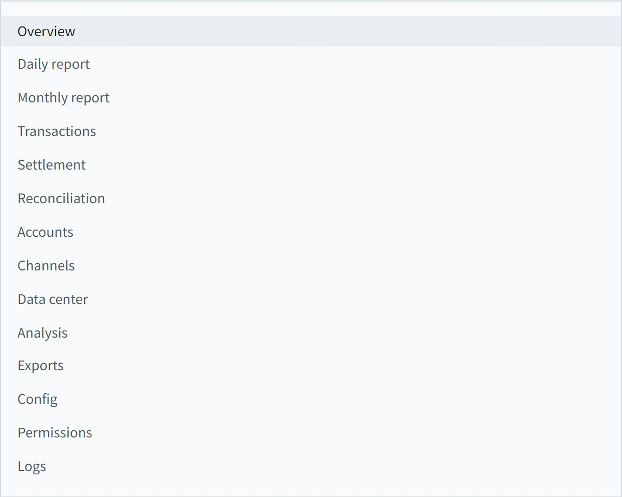
The existing structure grouped information by document type. A morning check required interpreting the menu and metric labels before deciding where to go.
01
Fourteen entries put reports, operational queues and administration at the same level.
02
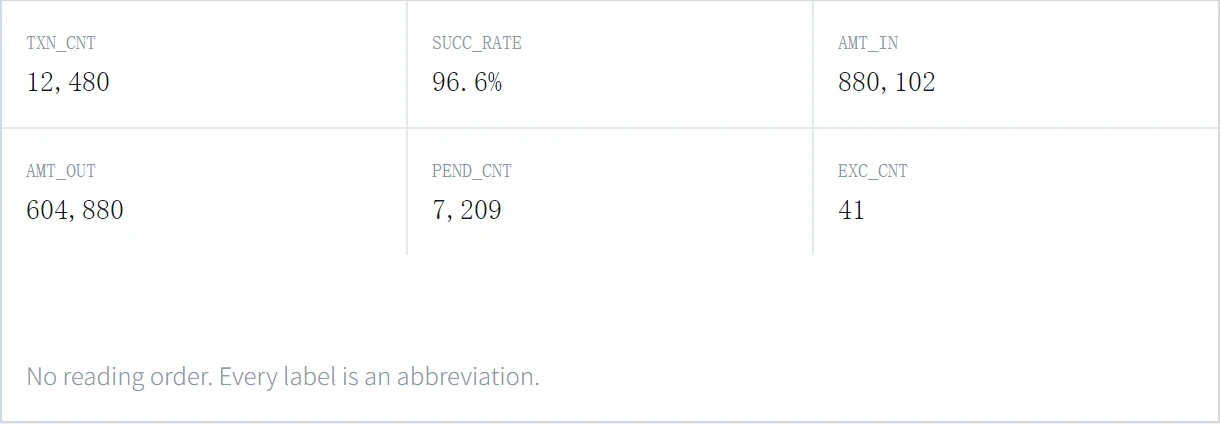
Abbreviations such as PEND_CNT required interpretation before someone could act.
03
A dense transaction table dominated the screen, without a dedicated list of items needing attention.
A decision changed by testing
An early test changed my explanation of the problem and the direction of the next iteration.
01 · Initial hypothesis
The dashboard used similar colors and gave information similar visual weight. I first explored color changes to make the screen easier to scan.
02 · Early test
The improvement I observed was limited, and feedback was mixed. I reconsidered whether the screen communicated what to read first.
03 · Revised decision
I shifted to typography, text size and placement to establish clearer priorities. Color became a supporting cue within the hierarchy.
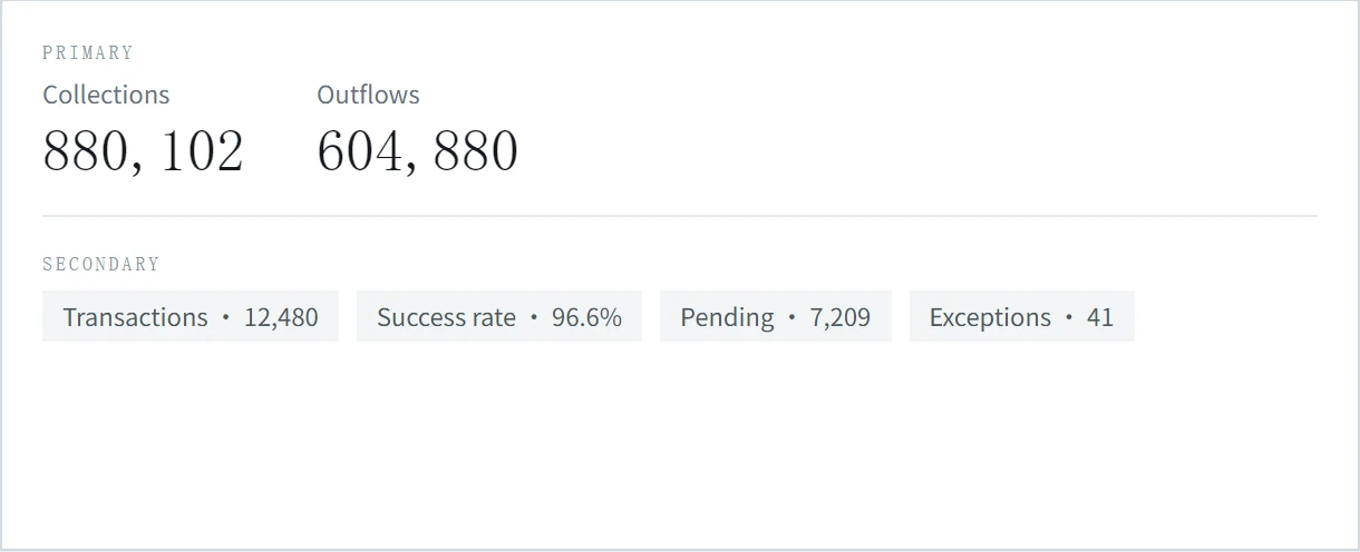
This reconstruction illustrates the shift in visual emphasis: primary figures lead, and supporting metrics follow.
Information consolidation
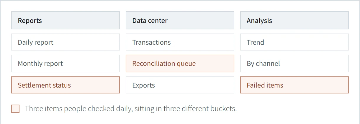
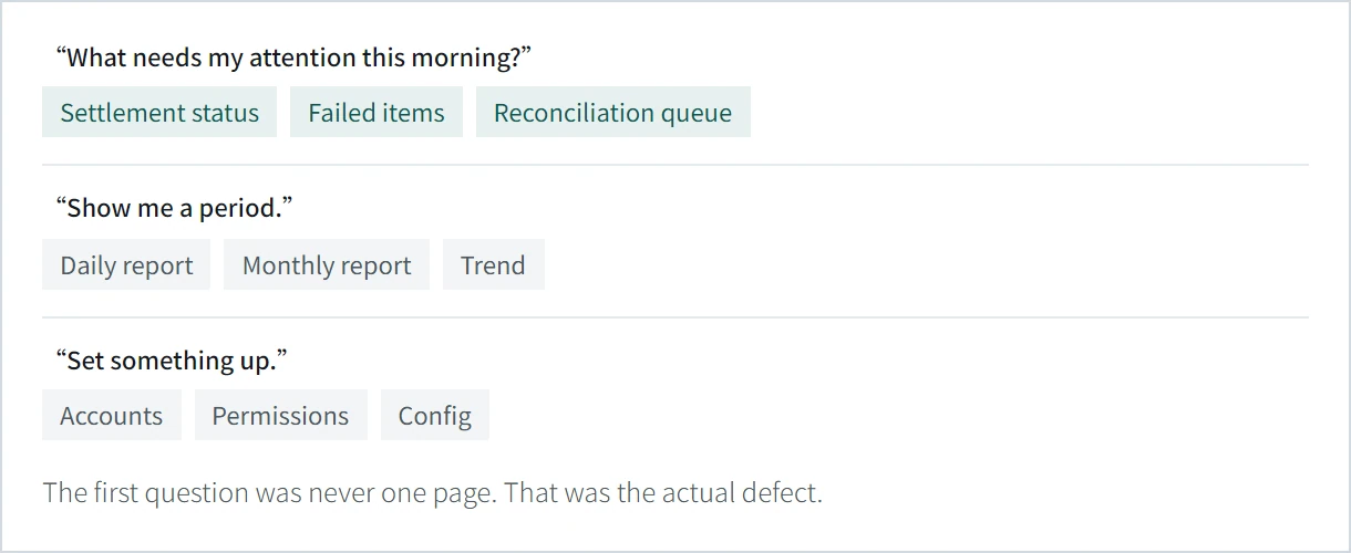
I used task-based questions to regroup the information, then worked through priorities with product and data.
Placement decision
I asked colleagues what they checked first when starting their daily work. Their feedback shaped the priority model below and the order of information on the dashboard.
| Information | Team | Cadence | Placement |
|---|---|---|---|
| Awaiting settlement | Operations | Every morning | Landing screen |
| Failed items | Operations | Every morning | Landing screen |
| Reconciliation queue | Finance | Daily | Direct entry |
| Daily / monthly reports | Finance | Weekly | Reporting group |
| Accounts, permissions, logs | Data team | Occasional | Separate admin |
Information architecture
The reconstructed navigation has nine main entries grouped by task. Accounts, permissions, configuration and logs sit under Admin.
Constraints & trade-offs
Data freshness
The dashboard could not refresh continuously. After colleagues explained the update cycle, I added an “As of” timestamp so users could judge how current the figures were.
Team input
I asked users what they checked first each morning, then placed their highest-priority information at the top. The hierarchy reflected their working routine.
Navigation trade-off
Existing users found top-level categories faster, but some initially took longer to find relocated items. One new hire, with little familiarity with the old menu, found items considerably faster in the redesign. I interpreted this as a possible adjustment cost; one employee cannot establish long-term adoption.
Next, I would follow returning users over time and consider familiar terminology or temporary navigation cues to ease the transition.